Have you ever visited a website and felt overwhelmed by the amount of information it contains? Your eyes jump from the headline to the button and back, and suddenly you don’t know what you were looking at. That reaction is a sign that the page isn’t structured in a way the brain can process easily.
This issue appears frequently during our UX audits and has a direct impact on conversion rates and website performance. Brands are left scratching their heads, not realising that a psychological response (i.e Cognitive Overload) is potentially the root cause of user drop-offs.
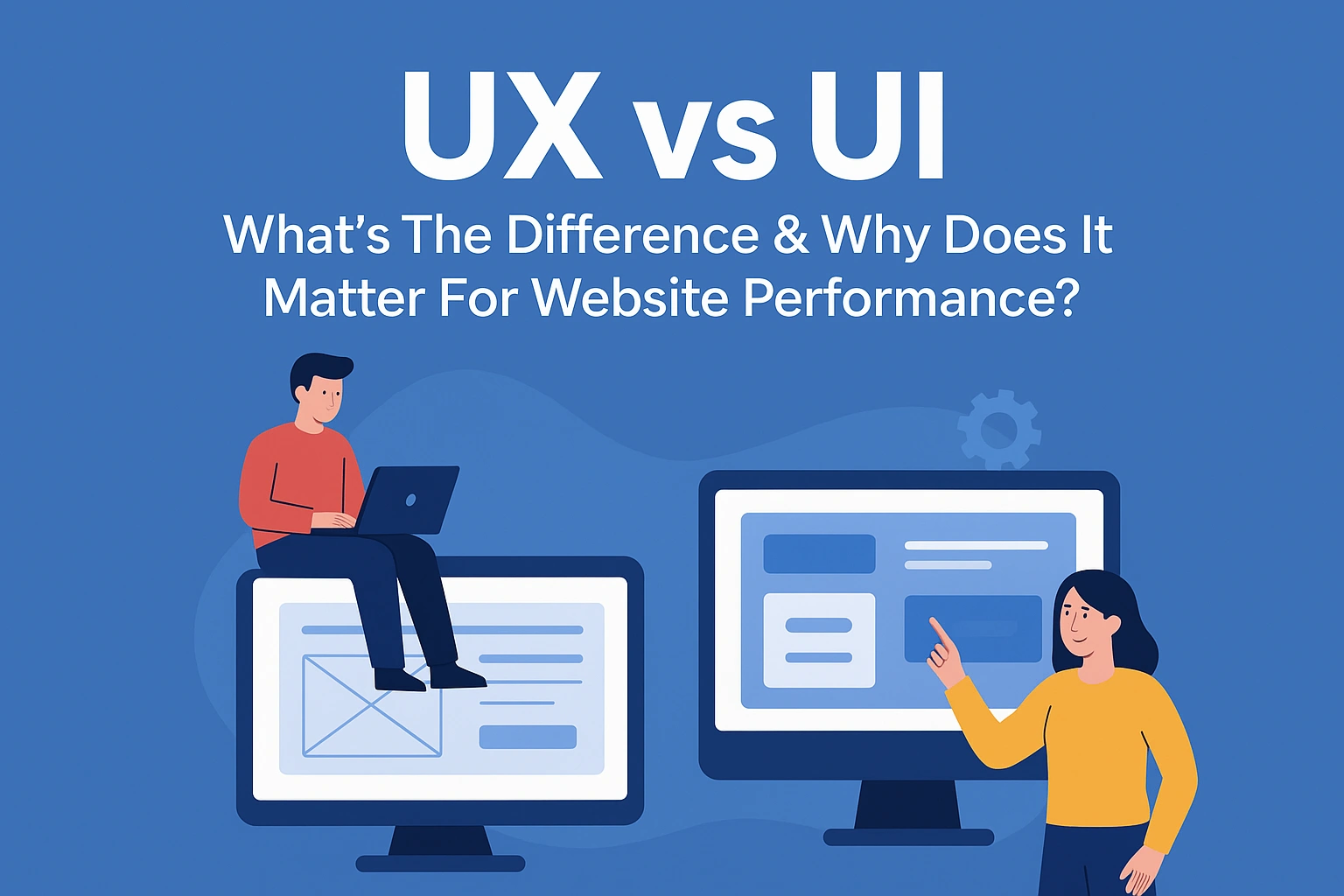
We’re taking a look at what Cognitive Overload is, how it affects user experience and why understanding the difference between UX and UI is essential for improving results.
Cognitive Overload: What Is It?
Cognitive Overload derives from Cognitive Load Theory, which was introduced by psychologist John Sweller in 1988. His research proposed that working memory has a limited capacity for holding and processing information at one time. Although this theory was developed in the context of learning and problem-solving, it can be applied to the online experiences of shoppers and inform modern UX.
If a user is presented with more information than their brain can process while browsing, Cognitive Overload can occur. Instead of engaging with the page, they become mentally fatigued and stop absorbing content, which can result in fewer clicks and purchases.
Types of Cognitive Overload
It’s important to note that Cognitive Overload doesn’t happen for just one reason or affect everyone in the same way either. There are three types that affect customers in different ways: Intrinsic, Extraneous and Germane Cognitive Overload.
Intrinsic Overload comes from the difficulty of the task, Extraneous Overload is caused by how information is presented and Germane Overload relates to how users process and understand what they are seeing. The three can build upon each other too. For example, Intrinsic Overload and Extraneous Overload can combine and leave the user with not enough working memory to handle Germane Overload.
Let’s break down each type to provide further clarity.
Intrinsic Overload

The first type of Cognitive Overload concerns the mental processing required for a task based on its difficulty and comes from the information rather than the task itself.
An example of this is completing a questionnaire with many questions. The user may experience Cognitive Overload and not be able to complete it due to the volume of questions. Even if the page is well designed, the amount of information that needs processing can feel overwhelming, making it harder to stay focused and increasing the chance they will abandon the questionnaire.
Extraneous Overload

This psychological response occurs when a user has to process too much information that is not relevant to the task or goal. In other words, the brain is working on unnecessary details. It’s not that the task is difficult, but the page design or content forces the user to figure out what is and isn’t important.
Extraneous Overload is often caused by poor layout, distracting visuals, vague copy and navigation that is not user-friendly. These elements create noise in the user’s brain and cause them to freeze. Think of it like being in a library. You’re reading a book and then a group of people walk in and make a lot of noise. The distraction stops you from reading. This is similar to what happens with Extraneous Overload.
In UX design, this is something you need to avoid because it disrupts the user’s progress, such as looking for the right button to click or being distracted by too many images. The more this appears on your website, the more likely cognitive friction becomes.
Germane Overload
Germane Overload is the mental analysis and understanding of a task that allows the user to make sense of the information and complete it with ease. Unlike Intrinsic Overload and Extraneous Overload, Germane Overload is not due to the task being difficult or the design being distracting. Instead, it is related to how users interpret what to do next.
For example, imagine you’ve just landed on a product page to buy a wardrobe. You can see different sizes, colours and storage setups. To choose the right one, you need to think through your space and what you need it for. That mental process is Germane Overload because you are working out which option suits you best.

Good UX should support this by presenting the wardrobe types in a clear order, allowing the user to feel confident about their purchase.
Examples of Cognitive Overload on Websites
We have covered the fundamentals of what Cognitive Overload is and how each type presents itself. Now let’s take a look at real-life situations where it can occur, leading users into non-essential decision-making.
These small moments all add up and disrupt the user journey, increasing the likelihood of drop-off.
Product Pages with Too Many Calls to Action
When a product page is packed with too many CTAs vying for attention, users are left unsure about what to do next. They have to stop, think and choose, creating friction.
Instead of feeling confident to take action, like adding an item to their basket, they start second-guessing themselves and consider other distractions on the page. Well done UX does the opposite. It keeps things simple, makes the primary CTA easy to spot and allows the secondary options to aid, not distract.
Homepage Hero Sections with Long Blocks of Text
A homepage hero filled with long blocks of text asks too much of the user from the very beginning. Most visitors scan a page to get a quick sense of what the site offers, and if the page is full of text that creates friction.
Shoppers have to stop, read and process everything before they can understand the value of the page. Instead of easing them in, it interrupts their flow and increases the likelihood of clicking away. A good hero section keeps things simple and clear. It delivers a straightforward message and guides the user towards their next step without overwhelming them in unnecessary detail.
Checkout Pages Asking for Unnecessary Information
A smooth, fuss-free checkout is pivotal for conversions, yet many websites still introduce unnecessary friction by asking for details that are not required. Fields like middle names or extra information that have no impact on the purchase force the user to pause and think, which creates Cognitive Overload.
Every additional field adds doubt or hesitation, especially when all the user wants to do is complete their purchase quickly. By keeping the checkout lean and only requesting what is necessary, you lower the risk of abandonment and make a successful sale far more likely.
Why Cognitive Overload Damages User Experience
Google found that first impressions of a website can form in less than 50 ms, indicating users decide instantly whether a page feels clear or overwhelming. With first impressions being everything, a poor UX experience can break trust immediately.
During our UX reviews, we typically see three main issues:
Selective Blindness
Selective blindness occurs when a page is so visually busy that users tune out parts of it. Overloaded layouts, multiple competing headlines and attention-grabbing banners pull the eye in several directions at once.
Instead of helping them find what they need, this noise forces their brain to filter out distractions, which means they ignore or exclude important information, even when you highlight it.
A cleaner layout helps guide users naturally, enabling key messages and CTAs to be found with ease.
Decision Paralysis
Decision paralysis occurs when a page presents users with many options, choices and components at once. Rather than aiding them, this overload creates hesitation. Shoppers feel uncertain about which route is the right one; they freeze, back out or leave the page.
This is potentially one of the most common reasons for drop-offs on landing pages and product pages, where clarity matters most. When customers cannot see the next step, decision paralysis prevails and breaks down their journey.
A focused design that limits choices and has a single priority helps shoppers move forward on their journey.
Cognitive Strain
Cognitive strain appears when content is difficult to process. Long paragraphs, unclear hierarchy and unstructured layouts make it harder for users to understand what the page is regarding.
Instead of scanning and absorbing the information, users have to slow down to make sense of it themselves.. Most visitors simply won’t do that. When content is heavy, users disengage, which contributes to a higher bounce rate and a weaker conversion funnel.
Presenting information in short, clear sections with a logical flow removes the mental strain and allows focused decision-making.
The Commercial Impact for Brands
Cognitive Overload not only impacts how your website feels, but it also has measurable effects on how users behave and your site performance.
When people are forced to process too much information or make unnecessary decisions, their attention drops and motivation falls with it. Leading to slower progression through the online journey, higher bounce rates, abandoned actions and a decline in conversions.
By recognising where Cognitive Overload appears and how it affects behaviour, you can identify the specific points in the journey that need simplifying, clarifying or redesigning to keep users moving forward with intent.
Higher Bounce Rates
If a user lands on a page and becomes overwhelmed, the chance of them leaving early increases. Cognitive Overload makes it harder to see the benefit of what the page offers or where they need to go next. Brands do not want the shopper to exit early before they engage with the content on the website. By taking steps to design webpages with this in mind, you can help to decrease the likelihood of a higher bounce rate across your site.
Lower Product Engagement
If information is hard to process and the layout is unbalanced with clutter, customers are less likely to browse products or interact with key elements on the page. Overwhelm leads to hesitation, and hesitation reduces the amount of time they spend looking at your product.
Poor Add-to-Cart Rates
A complicated or unclear experience affects purchase intent due to shoppers not being able to assess a product, compare options or find the primary call to action.They lose momentum, buyer confidence plummets and they’re far less likely to add items to their basket.
The Real Problem Isn’t Traffic, It’s Cognitive Overload
Brands often pour their energy into driving more traffic or trying to work out why traffic has dipped, but they overlook what happens once people land on the page. The real issue is rarely the volume of visitors. It’s that users cannot process what they are being shown.
When the layout, copy or structure creates Cognitive Overload, even highly targeted traffic won’t convert. However improving UX and UI elements across the site can potentially remove any mental friction that’s present and make the percentages work more in your favour.
Where UX and UI Fit Into This
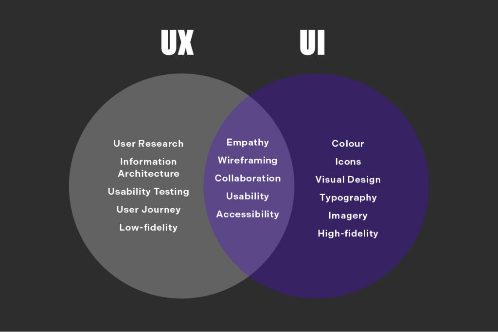
Brands mix up UX and UI, but understanding the difference is essential for reducing cognitive overload.
The two work together, but they solve different issues. UX focuses on how a user moves through a site and whether their journey feels intuitive. UI is the visual layer, encompassing the design of the visual journey.
When the two are confused, websites become convoluted and difficult to navigate. Balancing both is key to building a website experience which is seamless.
UX (User Experience)
UX is the journey users take through a website and the goal with all good UX design is to make that journey as enjoyable and seamless as possible. For example, every morning when you get ready for work, chances are you follow a familiar routine that helps you get ready without having to stop and think about every step. UX is designed to create that familiar feeling online, guiding shoppers from one stage to the next and removing friction to allow for a seamless journey.
Let’s take a closer look at two areas where good UX design can really help.
The Steps Needed to Complete a Task
In the digital world, users must follow a path to achieve something, whether that’s finding information, signing up for a service or completing a purchase. Clear steps reduce confusion, while unnecessary or repetitive steps derail the experience by making it long and frustrating. UX designed for the customer should make the path lean so shoppers can move forward without doubt.
Whether There Is Friction or Confusion
Friction appears when something feels difficult or unclear. Confusing page layouts, too many CTAs, vague messaging or unexpected steps all interrupt user flow. Each moment adds Cognitive Load and increases the risk of shoppers dropping off. Strong UX identifies these pressure points and removes them before they cause issues.
UI (User Interface)
UI is the visual layer of your website. It defines how the site looks and feels, and plays an important role in how confident users feel as they move through each page.
While UX guides the journey, UI provides the visual cues that make that journey clearer and engaging. Good UI design reduces Cognitive Overload by presenting information in a way the brain can process quickly and without effort.
Let’s take a look at some of the important elements that when designed correctly, can help to reduce or prevent cognitive overload.
Visual Consistency
Visual consistency creates a sense of balance across your website. When colours, spacing, layouts and imagery follow a clear pattern, users don’t need to re-learn the interface every time they move to a new page.
It also reduces mental strain and builds the site’s credibility too. Inconsistent visuals are the opposite of that and make the site feel disjointed, slowing users down and increasing friction.
Button Styles
Buttons guide users through key actions, so their design needs to be clear and predictable. Consistent button sizes, shapes and hover states help users recognise interactive elements instantly. When buttons vary too much or blend into the page, users hesitate because they can’t quickly tell what is clickable. Strong UI uses button styles that stand out without overwhelming the rest of the design.
Colour Usage
Colour utilisation plays an important part in usability and emotion. Drawing attention to key actions, making content easier to digest and creating a sense of order. Effective UI uses colour with intention: primary colours for the main actions, secondary colours for supporting elements and neutral tones where clarity matters. Poor colour choices can create confusion, visual clutter and accessibility issues.
Typography
Typography is about more than choosing a font. It affects readability, hierarchy and the rhythm of a page. Clear headings, well-sized body text and consistent spacing help users scan information without feeling overwhelmed. When typography is too small, dense or inconsistent, shoppers struggle to digest content, increasing cognitive strain and drop-offs.
The Simple Difference Summarised
To conclude, UX and UI must work together to create a streamlined customer journey. The aim is always to support the user as they move through the site, not distract or deflect them from completing their goal. When the journey and the visuals are aligned, users can navigate with confidence and understand what to do next without having to think too hard.
If they are misaligned, even simple actions can feel confusing or disjointed, increasing Cognitive Overload and pushing them away. A well-balanced approach ensures the experience feels clear and consistent from start to finish.
Final Thoughts
Cognitive Overload remains one of the biggest undetected barriers to performance. Cluttered layouts, unclear journeys and heavy content all make it harder for users to process information and move forward in their journey.
Designing with the user journey in mind enables online interactions to be easier to navigate, copy simpler to absorb, and each step feels natural. Focusing on this not only improves user experience but also strengthens engagement and conversions, utilising the traffic you already have.
If there is one takeaway, it is that simplifying the experience is often the most powerful change you can make.