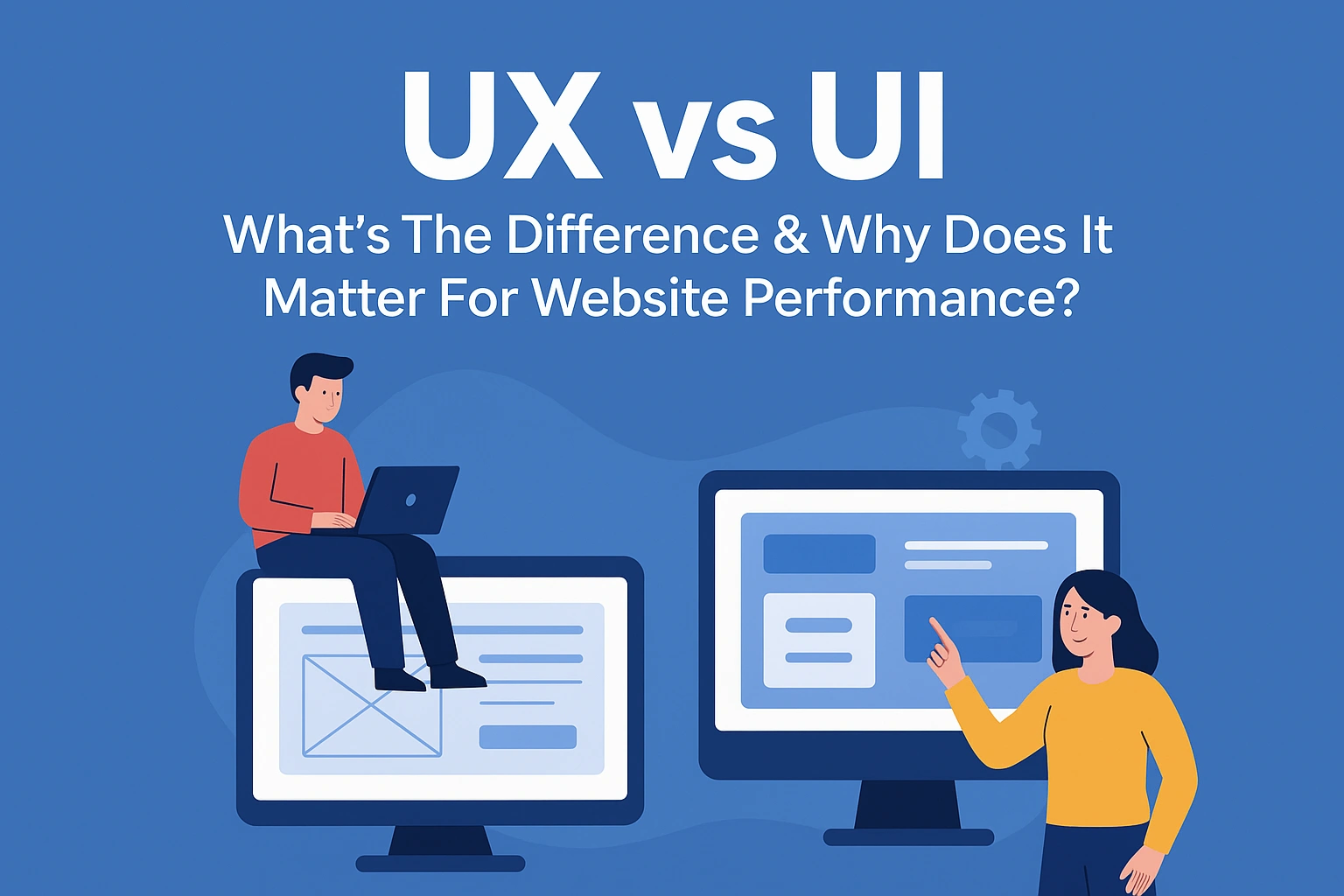
The terms of UX (user experience) and UI (user interface) are easily mixed up, as they go hand in hand with one another when it comes to the design of a website and the engagement of its users. It can be a little confusing at first – they’re quite similar but act in their own ways at the same time, although it’s not as complex as you may think.
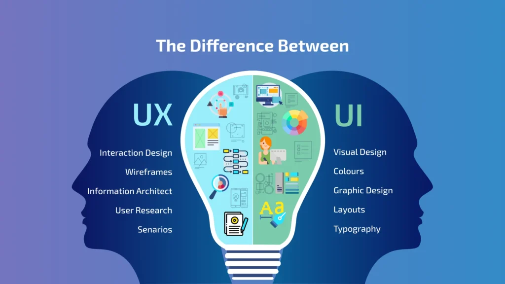
UX refers to the user’s experience of the website that they’re engaging with, such as how easy it is to carry out an action, how fast it takes for a page to load, the functionality of the search bar tool and the clarity of the menu navigation. Having a clear and fluent user experience can really transform your conversion rates, as people are more likely to think positively of your website if it feels more seamless, organised and professional.
UI is the user interface of the website, referring to visual design aspects such as the layout, icons, buttons, information architecture, colours, typography and animations. It’s a way to express your visual brand identity, make your website professional and attractive, and an important way of making an impactful impression. It plays an essential role in how you represent your company and give users a satisfying experience.
In simple terms, UX is like your experience in a coffee shop – the customer service, the time you’re waiting in the queue, the cleanliness of the environment and the taste of the coffee. The UI is more like the decor of the coffee shop, the music playing in the background, the centrepieces on the table, the menu design and the lighting. So, you can understand how these two elements of UX and UI work together to give the user a convenient and positive experience overall.
In this guide, we’ll show you exactly how UI and UX work together to create a positive and easy experience for your website. We’ll break down what key elements are involved in UX and UI, how they work together to drive conversions, the risk of choosing one without the other and ways to improve your website’s conversion rates. So, let’s dive in!
What Does UX Involve?
We’ve touched on the definition of UX and how it plays an important role in your conversions, so let’s break down some key elements of what makes a good user experience. UX is very broad, but we’ll show you some aspects of it, with tips that can help improve the experience of those who visit your website.
One of the most important aspects of what makes good UX is your menu navigation. Ensuring that the right products or services are tagged under the right subcategory is important for your users to find what they’re looking for without too much hassle. You want your customers, clients and users to seamlessly move around your website and find what they’re looking for without it taking them too long.
We’ve all been there before: we’re online shopping or looking for a service, but we can’t find what we’re looking for on the website. In fact, it’s so difficult to find that we get frustrated and perhaps even leave the website. So, having a clear structure really makes the process easier. Not only does this improve user experience, but having a logical site architecture is also really good for SEO – it makes it easier for search engines to understand the products and services you offer. Like a library categorising its book genres to make it easier for its visitors to find, Google needs the same.
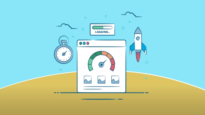
Having a fast page speed on your website is also really important for UX. If your pages are taking too long to load, images take a while to show up and your videos are buffering, people are likely to get a little bit annoyed as they find it difficult to navigate your website, or at least try to. To improve your user experience, we recommend that you use less storage on your website as much as possible. For example, you could use an image compressor to reduce your images’ file size without damaging their quality – there are plenty of free ones out there to use, but we can also take extra steps to further improve your page speed and UX.
Another aspect of good quality user experience is having readable content and clear typography. Having clear and consistent fonts not only helps with storage use, but it helps with improved readability as it’s more inclusive, builds trust and doesn’t cause any ambiguity. This is an effective way to give your users an easier, understandable and positive experience.
By reviewing your analytics, you can understand more behavioural insights into how your users interact with your website. Taking a look into their clicks, scrolling and hesitation patterns can really show you what areas may need improving and clarifying for your users.
What Does UI Involve?
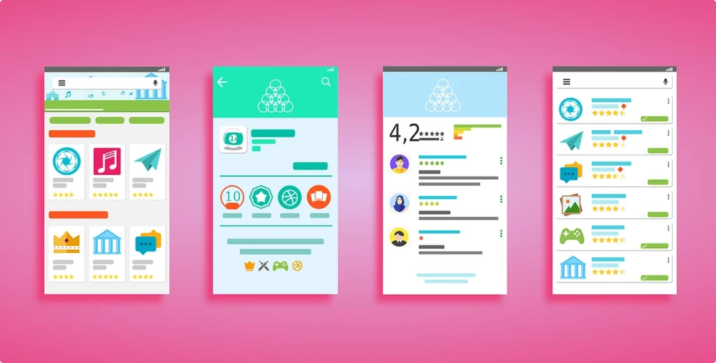
User interface is also just as important as UX when it comes to creating an inviting and easy experience on your website. Everything from the colour themes, layout, icons, colours and typography, as well as other visual intricacies of your website is important when it comes to representing who you are as a company and running a seamless website performance.
Psychologically, it only takes a couple of seconds to make a good first impression on your users. With good brand assets, consistent colour themes and clear designs, people are more likely to appreciate the professionalism of your website. So, by having a sleek and minimal website aesthetic that has consistent colour palettes and typography, your users are more likely to engage.
Implementing clear buttons, sliders and forms across your website is essential for your users to carry out a specific action. Whether it’s “buy now,” “add to cart,” or “sign up,” it matters how you clearly display these buttons to make the process easier for users, so you can convert more actions.
Another crucial aspect to improve user interface is spacing. This not only makes your pages feel less chaotic and cluttered, but it improves clarity and readability for your users. Spaces between headers, footers and typography can make your website look seamless and easy to read for all types of online visitors, and it generally reduces the chances of cognitive overload. This is where a user feels overwhelmed by the excessive information that is being shown to them and the brain cannot process everything at once.
Of course, when it comes to colour themes, it’s important to represent your digital identity, but using colours with no rhyme or reason can affect your user interface. If your colour schemes are random, people are less likely to remember who you are – a good consistent colour palette is important to make a stamp on who you are as a brand. Bold colours can be used to highlight certain CTA (calls to action) to generate more conversations and sales.
How They Work Together To Drive Conversions

UX and UI design don’t work separately, but more as a team to strive for a main goal: to make it easy for users to navigate your website and lead to conversions. You can’t really have one without the other, as UX is almost like the foundations or skeleton of the website, and UI is the other details and intricacies that make it complete.
UX ensures that someone’s journey through a website is easy and seamless, but to achieve this, you have to have good-quality UI. For example, at the checkout page, you may combine convenient auto-fills for addresses and a fast-loading page for UX, with a checkout button in a contrasting colour and trust badges to indicate security for UI elements.
The Risk Of Prioritising One Over The Other
It’s not the best idea to prioritise UX design over UI, or vice versa. It just doesn’t work! Ensuring that you implement effective UX and UI is essential when it comes to creating high-converting landing pages and category pages.
If a user sees that your design layout is too chaotic and inconsistent, it can leave the user with cognitive overload and potentially cause them to believe that your website is untrustworthy or amateur. Cluttered and unclear websites can affect the ease of use, making it confusing to navigate, hard to read and understand – it’s a big reason why UI and UX are like co-partners when it comes to building your website.
UX & UI: How Will I Know That They’re Not Converting Well?
It can be easy to identify your conversion levels on your website with your analytics. There are various metrics in which you can measure to get a better insight into how your website is performing.
One of these metrics includes the CTR (Click through rate) which reveals how many people are clicking on certain buttons and links. A low CRT may suggest that your forms or buttons are not clear enough for the user to spot, giving you a chance to take a look into this element of UI on your website. Another metric you can use is what’s known as heatmaps, revealing where users hesitate or get stuck on a certain page, so you can take a look at the UX aspects of your site.
Improve Your UX & UI Design With Us
At Simul Digital, we understand that designing your website that leads to high conversion rates can be a little bit tricky. If you’re a busy business owner, you may not have the time to keep track of your metrics, design new layouts and reconfigure your website, so that’s why we’re here to help you solve your issues. Don’t hesitate to contact us!